Introduction

In today's rapidly evolving digital landscape, the imperative for mobile-friendly website design cannot be overstated. As we delve deeper into an era where smartphones and tablets are becoming the primary gateway to the internet, the dynamics of web page design are undergoing a transformative shift. The surge in mobile device usage for internet access has ushered in a paradigm where mobile-first design is not just a preference but a necessity. This pivotal shift underscores the need for web designers and developers to prioritize mobile-friendly website design to cater to the ever-growing population of mobile users.
The essence of crafting a mobile-friendly web page goes beyond mere aesthetics; it's about creating an intuitive, accessible, and seamless browsing experience that aligns with the users' on-the-go lifestyle. As the digital world becomes increasingly mobile-centric, websites that fail to adapt to this change risk falling behind, missing out on significant traffic, and, ultimately, potential conversions. The stark reality is that mobile devices now account for over half of the global web traffic, a trend that's only set to grow. This seismic shift towards mobile browsing demands that web page design not only accommodates but also embraces the nuances of mobile usability.
Embracing mobile-friendly website design involves a comprehensive understanding of the user's journey on mobile devices. It means ensuring that every aspect of your website, from navigation and content layout to load times and interactivity, is optimized for the small screen. The goal is to deliver content in a way that's easily digestible, highly engaging, and effortlessly navigable with just the tap of a finger. In doing so, businesses can significantly enhance user engagement, reduce bounce rates, and improve search engine visibility, thereby driving more organic traffic to their site.
The shift towards mobile-friendly web page design is not merely a trend but a reflection of the changing consumer behaviour and preferences. In recognizing this shift, web designers are tasked with a critical role: to create responsive, fast-loading, and content-rich websites that are not just visually appealing but also functionally robust across all mobile platforms. By integrating mobile-first design principles, leveraging advanced web technologies, and focusing on user experience, designers can ensure that their websites are perfectly poised to meet the demands of today's mobile-savvy audience.
Understanding User Intent in Mobile Web Design

Understanding the essence of user intent in mobile web design is pivotal in today’s fast-paced digital environment. A mobile-friendly design is not just about adapting a website for viewing on mobile devices; it’s about aligning the web experience with the user’s needs, preferences, and behaviours. This alignment is where the heart of user-centric mobile design beats, ensuring that every aspect of the web page design is thoughtfully crafted to provide an intuitive, efficient, and enjoyable browsing experience.
At the core of user-centric mobile design lies the principle of responsiveness. Responsive web design best practices are not just technical guidelines; they are the blueprint for creating digital spaces that users love to explore. These practices advocate for flexible layouts, images, and CSS media queries to ensure that web content looks great and functions flawlessly across a broad spectrum of devices. But why is this important? At the end of the day, the user's journey should be seamless, whether they're scrolling through a site on a crisp desktop monitor or tapping through pages on a smartphone screen.
The direct address of user needs through mobile-friendly design is not a one-size-fits-all approach. It requires a deep dive into understanding who the users are, what they seek, and how they interact with digital content on mobile devices. This understanding translates into designing with the user in mind, a philosophy that embeds the principles of accessibility, load time optimization, and touch-friendly navigation at its foundation. By embracing semantic keywords like 'user-centric mobile design,' designers and developers can ensure that their projects resonate with the intended audience, fostering engagement and satisfaction.
Moreover, incorporating responsive web design best practices into mobile web projects is a commitment to excellence. It signifies an understanding that users' preferences for consuming digital content are diverse yet valid. By crafting websites that adapt and respond to the myriad ways users interact with content, designers validate the user's choice, ensuring that their experience is not just accommodated but celebrated.
Key Components of a Mobile-Friendly Web Page

In the digital realm, where mobile reigns supreme, crafting a mobile-friendly web page is not just an advantage—it's a necessity. Let's delve into the key components that make up the backbone of a mobile-optimized site, adhering to the paramount principles of user-centric mobile design and responsive web design best practices.
Responsive Design
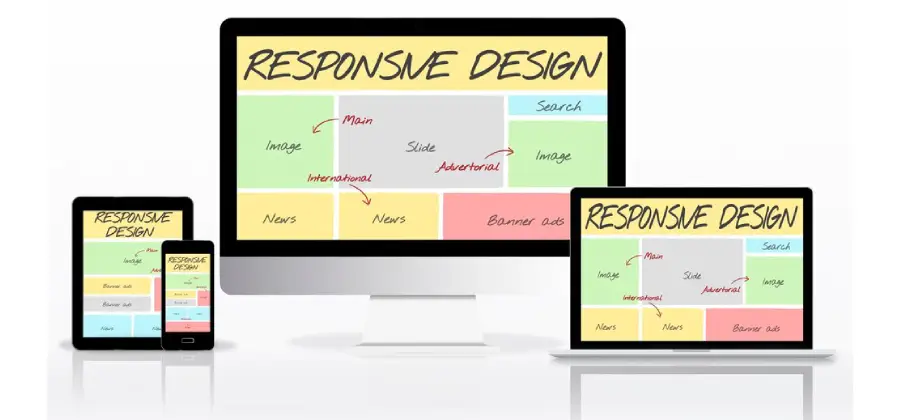
At the core of any mobile-friendly website lies the responsive design—a dynamic framework that adapts to the screen size and orientation of any device. Utilizing CSS media queries, responsive design ensures that your site offers an optimal viewing experience across a wide array of devices. By integrating fluid grid systems, your content resizes beautifully to fit the screen, whether it's viewed on a desktop monitor or a smartphone screen. The technical sophistication behind responsive design lies in its ability to create a flexible, seamless user experience, eliminating the need for separate website versions.
Speed Optimization
In the fast-paced digital world, speed is of the essence. Page speed optimization becomes crucial as users expect instantaneous loading times. Techniques such as minifying resources—compressing CSS, HTML, and JavaScript files—significantly reduce load times, enhancing user satisfaction. Optimizing images, by reducing file sizes without compromising quality, and minimizing code bloat through efficient coding practices, further accelerates page speed. These steps are vital in keeping your audience engaged and reducing bounce rates.
Navigational Clarity
Navigating a website on a mobile device should feel intuitive and effortless. Clear, thumb-friendly navigation is pivotal, with elements like the hamburger menu simplifying access to different sections of your site. Touchscreen-friendly interfaces enhance the user experience by making website interaction natural and straightforward. Implementing easily accessible menus and ensuring that call-to-action buttons are prominently placed and easy to tap can significantly improve navigational clarity and user engagement.
Readability and Content Layout

Mobile readability and content prioritization are essential in presenting information in a digestible manner. Opting for larger font sizes ensures text is easily readable on small screens, while the strategic use of whitespace can aid in focusing attention on the most important content. Establishing a clear content hierarchy guides users through your site in a logical, user-friendly manner, enhancing the overall user experience.
Technical Considerations
To ensure your website meets modern mobile standards, several technical considerations must be addressed. Implementing viewport meta tags guarantees your site scales correctly on any device, offering a tailored browsing experience. Moving away from outdated technologies like Flash, in favour of HTML5 and CSS3, ensures compatibility and accessibility. Incorporating Accelerated Mobile Pages (AMP) can further boost your site's speed, offering near-instantaneous loading times for mobile users.
Real-World Examples of Incorporating Mobile Design

In the dynamic landscape of digital marketing, where the pulse of user engagement is increasingly measured through mobile screens, incorporating mobile design best practices isn't just a trend—it's a pivotal strategy. This strategy’s success is vividly demonstrated through real-world case studies that highlight the transformative power of mobile-friendly design elements on user engagement and search rankings.
Elevating User Experience with Responsive Design: The Zara Case
Take, for instance, the global fashion giant, Zara. Zara’s web page design underwent a significant overhaul to embrace a responsive layout fully. Utilizing CSS media queries and fluid grid systems, the website now seamlessly adapts to various screen sizes, ensuring a consistent and engaging user experience across devices. The impact? A substantial uptick in user time spent on site and a notable reduction in bounce rates. This shift not only cemented Zara's digital presence but also showcased the direct correlation between responsive design and user engagement metrics.
Speed Optimization: The Bloomberg Leap
In the digital realm, where patience is scarce, speed is currency. Bloomberg recognized this early on, implementing advanced page speed optimization techniques, such as minifying resources and optimizing images. By reducing code bloat and streamlining content delivery, Bloomberg's mobile site now loads in a fraction of the time it previously took. The result was a dramatic increase in page views per session and a significant boost in their search engine rankings. This case underscores the critical role of speed in enhancing user satisfaction and bolstering SEO efforts.
Navigational Clarity and the Starbucks Revolution
Starbucks’ mobile web design epitomizes the significance of navigational clarity. By integrating a hamburger menu and touchscreen-friendly interfaces, Starbucks made it incredibly easy for customers to browse their menus, place orders, and customize their drinks on mobile devices. This user-centric mobile design approach resulted in a surge in mobile orders, proving that clear, thumb-friendly navigation can directly influence conversion rates and customer loyalty.
Readability and Content Layout: The Medium Paradigm
Medium, a leading online publishing platform, demonstrates the importance of readability and content layout in mobile web design. By focusing on mobile readability and content prioritization, Medium ensures that articles are not only easy to read on mobile devices but also engaging. The use of whitespace, legible font sizes, and a clean content hierarchy allows for an immersive reading experience, translating into longer session durations and higher content-sharing rates.
Technical Considerations: The AMP Project
The Accelerated Mobile Pages (AMP) Project, an open-source initiative, aims to drastically improve the mobile browsing experience by ensuring web pages load instantly. Websites adopting AMP, like The Washington Post, have witnessed a notable decrease in load times, leading to a 23% increase in mobile search users who return within seven days. This example highlights the importance of adopting technical measures like viewport meta tags and AMP to reduce loading times and enhance mobile user engagement.
These case studies underscore the tangible benefits of incorporating mobile design best practices, from improved user engagement to enhanced search rankings. By analyzing these successes, it becomes clear that a well-executed mobile-friendly website design is not just beneficial but essential in today's digital marketing landscape.
Testing and Improving Your Mobile Website

In the fast-paced digital world, the mantra for success is not just to launch but to evolve continuously. The cornerstone of this evolution, especially in the realm of mobile web design, lies in the rigorous and ongoing testing of your mobile website. This process is crucial not only for uncovering hidden issues but also for validating that your site remains accessible, user-friendly, and finely tuned to the ever-changing algorithms of search engines.
The Imperative of Testing on Real Devices
While simulators and emulators offer a glimpse into how a website might perform across different devices, nothing beats the accuracy and insights gained from testing on real devices. This approach allows you to experience your site just as your users do, uncovering nuances and potential friction points that could impact their experience. With a plethora of devices on the market, each with its screen sizes, resolutions, and operating systems, testing on real devices ensures your website delivers a consistent and optimal user experience universally.
Leveraging Google's Mobile-Friendly Test
One of the first steps in this journey of continuous improvement is utilizing tools designed to assess your mobile website’s performance. Google's Mobile-Friendly Test is a prime example, providing a quick and comprehensive analysis of how well your site performs on mobile devices. Here’s how you can leverage this tool effectively:
- Initiate the Test: Start by entering your website’s URL into the Mobile-Friendly Test tool. Google will then analyze your site, assessing various factors such as readability, navigation, and content layout on mobile devices.
- Interpreting the Results: Once the analysis is complete, you’ll receive a report indicating whether your site is mobile-friendly. Beyond this binary result, pay close attention to the specific issues highlighted, such as text too small to read, clickable elements too close together, or content wider than the screen.
- Prioritize Improvements: Not all fixes are created equal. Prioritize changes based on their potential impact on user experience and your SEO rankings. Address critical issues first, such as those affecting usability or leading to content being inaccessible or unreadable on mobile devices.
- Implement Changes: Armed with insights from the test, begin making the necessary improvements. This might involve adjusting the size and spacing of elements, enhancing readability with larger font sizes, or restructuring your site’s layout to ensure a fluid, intuitive user experience across all mobile devices.
- Rinse and Repeat: The digital landscape and user expectations are ever-evolving. Regularly retest your site after implementing changes and as part of an ongoing maintenance strategy. This ensures your site remains optimized and ahead of the curve, adapting to new technologies and user behaviours.
Iterative Improvements: The Path to Perfection
Iterative improvements, grounded in real user data and testing insights, are the key to refining and perfecting your mobile website. This cycle of testing, analyzing, and enhancing allows you to gradually elevate the user experience, ensuring your site not only meets but exceeds the expectations of your mobile audience.
- Gather User Feedback: Beyond automated tools, consider soliciting direct feedback from your users. Surveys, user testing sessions, and analytics can provide invaluable insights into how real users interact with your site and where they encounter difficulties.
- Monitor Performance Metrics: Keep an eye on key performance indicators such as page load times, bounce rates, and conversion rates. These metrics can offer clues to the effectiveness of your optimizations and areas that may require further attention.
- Stay Informed: The best practices in mobile web design are continually evolving. Stay informed about the latest trends, technologies, and Google’s guidelines to ensure your site remains at the forefront of mobile optimization.
Conclusion

As we navigate through the labyrinth of digital evolution, it's clear that the future of web browsing is not just leaning but vaulting towards mobile-first ideologies. The importance of mobile-friendly design in crafting web experiences that not only meet but exceed user expectations cannot be overstressed. In a realm where user satisfaction is paramount, ensuring your website's mobile-friendly design is a non-negotiable cornerstone for enhancing user engagement and, inherently, bolstering your SEO performance.
The journey towards optimizing web page design for mobile devices is akin to sailing in dynamic waters; the landscape is constantly changing, and staying ahead requires agility, foresight, and an unwavering commitment to innovation. The rise of mobile technology advancements presents both a challenge and an opportunity. It's an invitation to web designers and developers to push the boundaries of creativity, to rethink and reshape the user experience in ways that are intuitive, engaging, and, above all, user-centric.
In the spirit of fostering a digital ecosystem that is inclusive, accessible, and rewarding, I encourage you, fellow architects of the digital domain, to embrace the ethos of continuous evolution. Let your web page design be a living entity, one that grows, adapts, and evolves in tandem with the advancements in mobile technology. The quest for mobile optimization is not a destination but a journey—a journey marked by perpetual learning, testing, and refining.
Harness the power of responsive web design, prioritize speed optimization, ensure navigational clarity, and uphold readability and content layout. These are not mere strategies but pillars that support the edifice of a successful, mobile-friendly website design. In doing so, you're not just building websites; you're crafting experiences. Experiences that resonate, engage, and convert.
The digital landscape of tomorrow beckons with opportunities ripe for the taking. By aligning your web page design with the principles of mobile-friendly design, you're not just keeping pace with the present; you're gearing up for the future. A future where the web is an even more vibrant, dynamic, and inclusive space, ready to meet the ever-evolving needs of the mobile user.
Leave a Comment
Your email address will not be published. Required fields are marked *