Introduction
In the dynamic world of digital marketing, landing pages emerge as pivotal battlegrounds where brands convert casual browsers into committed leads or customers. These pages are not just mere extensions of your website; they are the crescendo of your marketing efforts, where the art of persuasion meets the science of SEO. Understanding the critical role of landing pages in converting visitors underscores the necessity for meticulously crafted, conversion-optimized pages that not only captivate but also convert.
The Anatomy of a Successful Landing Page

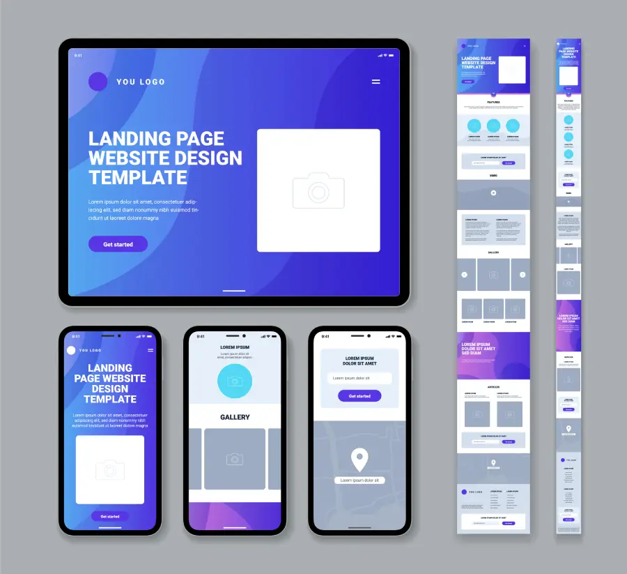
At the heart of every successful digital campaign lies a landing page designed to turn interest into action. But what elements conspire to make a landing page not just good, but great? Let's dissect the anatomy of a high-converting landing page:
- Headline: Your first impression must be powerful and immediate. A compelling headline grabs attention and succinctly communicates the value proposition, promising the visitor that they're in the right place.
- Call-to-Action (CTA): This is the linchpin of your landing page. A clear, persuasive CTA button guides users towards the action you want them to take, be it subscribing, downloading, or purchasing. The secret? Make it impossible to ignore.
- Images/Videos: A picture is worth a thousand words, and a video might well be worth a thousand pictures. Engaging visuals and videos can explain complex concepts simply, evoke emotions, and significantly increase the time visitors spend on your page.
- Forms: The gatekeepers of your leads. The form should be as inviting as it is easy to fill out, asking for just enough information to continue the conversation without overwhelming the visitor.
- Social Proof: Testimonials, reviews, and logos of previous clients or partners lend credibility and build trust. They tell your visitors, "Others have succeeded with us; so can you."
Incorporating these essential components with a keen focus on landing page structure and conversion-focused design ensures that your landing page not only meets but exceeds user expectations. A successful landing page is a symphony of strategic layout, persuasive content, and engaging visuals, all harmonized to guide the visitor toward that all-important conversion.
Deep Dive into Essential Landing Page Elements
Creating a landing page that converts is an art form, where each element plays a crucial role in guiding visitors toward your desired action. Let’s unravel the components that make a landing page not just functional, but phenomenal.
Compelling Headlines that Capture Attention

The Importance of First Impressions:
In the digital realm, first impressions are formed in milliseconds. Your headline is the welcoming handshake, the first words exchanged in a potentially fruitful conversation. It needs to be powerful enough to stop visitors in their tracks and intriguing enough to encourage further exploration.
How to Craft Headlines:
Crafting an irresistible headline involves merging clarity with curiosity. Use action words that convey the benefit directly, such as “Transform,” “Discover,” “Unlock,” or “Boost.” The headline should promise a specific outcome or solution that aligns with the visitor's needs. For instance, “Unlock Your Full Potential with Our Proven Strategies” clearly states the benefit and action, making it instantly compelling.
Clear and Persuasive Calls-to-Action (CTAs)

The Role of CTAs in Guiding User Actions:
A Call-to-Action is the signpost on the road, directing visitors where you want them to go. A well-placed, clear CTA can significantly increase your conversion rates, turning passive browsers into active participants.
Examples of Effective CTAs:
What works is a CTA that stands out yet seamlessly integrates with the page’s narrative. Use contrasting colors to make the CTA button pop, and ensure the text is direct and action-oriented. “Get Started,” “Download Now,” and “Join Free for a Month” are examples of CTAs that leave no ambiguity about what happens next.
Engaging Visuals that Tell a Story
Choosing the Right Images and Videos for Your Landing Page:
Select visuals that reflect the message and emotion you want to convey. Your imagery should encapsulate the essence of the offer, making the benefits tangible. For a service that offers tranquility, images of serene landscapes can be more convincing than words.
The Impact of Visuals:
Humans are visual creatures, and the right visuals can dramatically enhance user engagement and emotional connection. Videos, in particular, offer a dynamic way to demonstrate value and explain complex concepts in an easily digestible format.
Concise and Convincing Copy
Writing Copy That Resonates with Your Audience:
The copy on your landing page is your voice in the room, speaking directly to your visitor's needs, desires, and pain points. It should be engaging, informative, and concise, stripping away any fluff that distracts from the core message.
Tips for Writing Landing Page Copy:
Keep it short, focusing on how your offer solves the visitor's problem. Use bullet points to highlight key benefits, and ensure every word earns its place on the page. A conversational tone can make the text more relatable and persuasive.
Social Proof and Testimonials

Building Trust and Credibility with Your Audience:
Trust is the currency of the internet, and social proof is how you bank it. By showcasing the experiences of others, you borrow their credibility, reassuring new visitors that they’re making the right choice.
Incorporating Social Proof:
Use testimonials that speak to specific benefits or overcome objections. Including a name, photo, or video can make the testimonial more relatable. Logos of well-known businesses, trust badges, and real-time stats (like “1000+ happy customers”) also serve as powerful endorsements of your offering.
Optimizing for User Intent and Experience

Creating a landing page that resonates with your audience requires a deep understanding of their needs and expectations. The journey of a visitor from interest to conversion is paved with intent - a desire for a solution, information, or a service. Recognizing this intent and optimizing your landing page to meet these needs is crucial for not just attracting, but engaging and converting visitors.
Understanding the Needs of Your Landing Page Visitors
Each visitor lands on your page with a specific goal in mind. Some seek information, others are ready to purchase, and many are considering their options. A successful landing page addresses these varying intents through targeted content, clear messaging, and a direct path to action. Utilizing LSI keywords like "effective solutions," "user engagement," and "immediate benefits" within your content can subtly address these diverse intents, making your page more relevant and compelling.
Creating a User-Centric Design
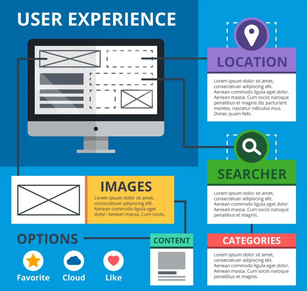
A user-centric design focuses on creating a seamless, intuitive user experience. This means tailoring the layout, content, and navigation of your landing page to be as straightforward and enjoyable as possible. Key elements include a clean design, easy-to-read fonts, and logical navigation that guides the visitor towards the desired action without confusion or distraction. Incorporating elements like "intuitive navigation" and "engaging layout" into your design philosophy ensures that your landing page is not only aesthetically pleasing but also functionally optimized for user needs.
Enhancing Credibility Through Expertise
In the digital world, credibility can be your strongest asset or your weakest link. Visitors are more likely to convert if they trust your expertise and authority in your field.
Showcasing Your Knowledge and Authority
Highlighting your expertise through well-researched content, detailed explanations, and insights into industry trends can significantly enhance your landing page's credibility. Using semantic keywords such as "industry-leading," "research-backed," and "expert insights" can further reinforce your authority, making your arguments more persuasive and your advice more trustworthy.
Adding Expert Opinions and Case Studies
Including expert opinions, endorsements, and case studies on your landing page adds a layer of credibility that is hard to ignore. These elements act as tangible proof of your claims, showcasing real-world applications and results. By leveraging industry insights and success stories, you transform your landing page from a simple promotional tool into a compelling narrative of success and expertise.
Strategies for High-Converting Landing Pages

The ultimate goal of any landing page is conversion. Combining all the elements of great content, design, and credibility is the foundation, but applying targeted strategies can maximize your conversion potential.
Combining All Elements for Maximum Impact
A high-converting landing page is more than the sum of its parts. It's a carefully crafted combination of compelling headlines, persuasive CTAs, engaging visuals, concise copy, social proof, and optimized user experience. Ensuring these elements work in harmony can create a powerful conversion engine, driving visitors to take the desired action.
Actionable Tips and Best Practices
To elevate your landing page's performance, consider the following actionable tips:
- A/B test different elements of your landing page to find the most effective combinations.
- Use data-driven insights to refine your approach, focusing on what truly resonates with your audience.
- Keep your message clear and your design uncluttered to maintain focus on the conversion goal.
- Regularly update your content to reflect the latest trends, research, and customer feedback.
Case Studies: Landing Page Success Stories
The digital marketing landscape is filled with tales of triumph and transformation, particularly in the realm of landing pages. These success stories not only inspire but also provide actionable insights into what makes a landing page not just good, but truly great. Let's delve into some real-world examples and distill the key takeaways from these successful implementations.
Case Study 1: TrustLink Qatar - Simplifying Business Setup in Qatar
Background:
TrustLink Qatar emerges as a beacon for entrepreneurs and corporations aiming to navigate the intricate process of establishing a business in Qatar. With a promise of 100% foreign ownership, TrustLink caters to a diverse clientele, ensuring a smooth transition into the Qatari market. This case study delves into how TrustLink Qatar has positioned itself as a leading service provider for company formation and registration, highlighting its unique selling propositions and success strategies.
Challenges Addressed:
- Navigating the legal and regulatory framework for business setup in Qatar.
- Offering comprehensive solutions for various business types, including LLCs, Free Zone Companies, and more.
- Ensuring a streamlined process for foreign investors seeking to leverage Qatar's strategic location and economic growth.
Strategies for Success:
- Expert Guidance: TrustLink Qatar distinguishes itself through a multilingual team of experts proficient in both Shariah Laws for Muslims and Civil Laws for non-Muslims, offering personalized consultations to align with each client's business goals.
- Wide Range of Services: From company formation and legal translations to ISO certification and tax & annual auditing, TrustLink provides an all-encompassing suite of services to cover every aspect of business setup and operation in Qatar.
- Customer-Centric Approach: Highlighting a commitment to customer satisfaction, TrustLink ensures 24/7 availability and advice, underpinned by a decade of experience in the Abu Dhabi market.
Key Takeaways:
- Tailored Solutions: TrustLink's success is partly due to its ability to provide tailored solutions that respect clients' unique needs while ensuring compliance with Qatar's legal requirements.
- Strategic Business Insights: By offering a free business consultation, TrustLink effectively attracts potential clients, offering them valuable insights into the benefits of setting up a business in Qatar.
- Comprehensive Support: The provision of ongoing support post-establishment signifies TrustLink's dedication to the long-term success of its clients, fostering a trusted partnership.
Conclusion:
TrustLink Qatar's landing page is a testament to its expertise and comprehensive approach to business setup in Qatar. By eliminating complexities and offering a roadmap to success, TrustLink ensures that businesses not only start on the right foot but also continue to thrive in Qatar's dynamic economic landscape. This case study exemplifies how understanding client needs, coupled with expert knowledge and a full spectrum of services, can position a company as an indispensable ally in business formation and growth.
Case Study 2: Fotis Law Firm's Family Law Landing Page
Overview:
Fotis Law Firm, a leading legal entity in Abu Dhabi, exemplifies how a well-structured and informative landing page can significantly enhance user engagement and conversion rates. Specializing in family law, Fotis Law has meticulously designed their landing page to address the sensitive nature of family-related legal matters, ensuring that potential clients find the assurance and information they seek right from their first interaction.
Challenges Addressed:
Family law encompasses sensitive issues ranging from divorce to child custody. Clients seeking legal assistance in such matters are often going through emotionally challenging times. Fotis Law recognized the importance of creating a landing page that not only provided detailed information about their services but also conveyed a sense of empathy, understanding, and assurance.
Strategies for Success:
- Comprehensive Service Listing: The landing page offers a clear overview of services, including alimony, divorce filing, guardianship, and more. This broad spectrum of services is presented upfront, making it easy for visitors to identify the assistance they need.
- Expert Team Profiles: Highlighting the expertise of their legal team, including partners like George SK and Marwan Mohamed Al Maazmi, the page establishes credibility and builds trust. Detailed profiles provide insight into each lawyer's specialization, reinforcing the firm's authority in family law.
- User-Centric Design: With a clean layout, accessible contact information, and a straightforward navigation system, the landing page is optimized for user experience. The design ensures that visitors can effortlessly find information or reach out for a consultation.
- Multilingual Support and Shariah Law Expertise: Acknowledging the diverse demographic of Abu Dhabi, the landing page mentions multilingual team capabilities and comprehensive experience in Shariah Laws for Muslims and Civil Laws for non-Muslims, addressing the unique legal requirements of all residents.
Key Takeaways:
Fotis Law's landing page stands out as a beacon of how legal services can be presented with clarity, empathy, and professionalism. The key takeaways from their successful implementation include:
- Empathy in Design: The sensitive nature of family law services is reflected in the page’s empathetic tone and user-friendly design.
- Clear Service Descriptions: Detailed service listings help visitors quickly identify the legal assistance they require, facilitating a faster decision-making process.
- Authority and Trustworthiness: By showcasing the qualifications and experience of their legal team, Fotis Law enhances its credibility and establishes a trust bond with potential clients.
- Accessibility and Inclusivity: The landing page’s design and content cater to a diverse audience, making legal assistance accessible to everyone in need.
Fotis Law’s family law landing page exemplifies a perfect blend of empathy, expertise, and user-centric design, setting a high standard for legal service providers aiming to create effective and engaging landing pages.
Case Study 3: Al Sirhan Shoes - Revolutionizing Footwear Shopping in Kuwait
Background:
Al Sirhan Shoes has positioned itself as a cornerstone in the footwear market in Kuwait, offering an extensive array of shoes for men, women, and kids. With a rich legacy and a keen understanding of customer needs, Al Sirhan Shoes embarked on digitizing their storefront, aiming to enhance the shopping experience through their online platform, "https://shop.alsirhanshoes.com/". This case study explores how Al Sirhan Shoes seamlessly blends traditional values with modern e-commerce trends to meet the evolving demands of consumers.
Challenges Addressed:
- Transitioning from a traditional in-store shopping experience to a comprehensive online platform.
- Catering to a diverse customer base with varied footwear needs and preferences.
- Ensuring ease of navigation and accessibility in both Arabic and English to accommodate all customers.
Strategies for Success:
- Diverse Brand Portfolio: Al Sirhan Shoes strategically partnered with globally recognized brands like Skechers, Kybun, and On Running, alongside regional favorites such as Tamima and Alboom, offering a wide selection that appeals to all demographics.
- User-Friendly Website Design: The online platform was meticulously designed to ensure ease of navigation, with clear categorization of footwear types and brands, making the shopping experience intuitive and enjoyable for all users.
- Multilingual Support: Acknowledging Kuwait's diverse population, the website supports both Arabic and English, facilitating a comfortable shopping experience for every customer.
Key Takeaways:
- Meeting Customer Expectations: Al Sirhan Shoes' transition to an online platform was met with positive feedback, as customers appreciated the convenience and variety available at their fingertips.
- Accessibility and Convenience: The introduction of a user-friendly, multilingual website addressed the growing demand for accessible online shopping options, catering to a wider audience and ensuring customer satisfaction.
- Promotional Offers: The website's dedicated offers section highlights Al Sirhan Shoes' commitment to providing value to their customers, featuring deals that encourage both new and repeat business.
Al Sirhan Shoes' foray into e-commerce represents a successful melding of traditional business acumen with digital innovation. By focusing on customer needs, embracing technology, and maintaining a diverse product range, Al Sirhan Shoes has solidified its position as a go-to destination for footwear in Kuwait. This case study underscores the importance of evolving with consumer trends while staying true to core business values, setting a benchmark for retail success in the digital age.
Conclusion
Creating a landing page that resonates with visitors and encourages them to take action is an art form underpinned by strategic thinking and continuous refinement. The journey to crafting such a page is both exciting and challenging, requiring a deep understanding of your audience, clear articulation of your value proposition, and a relentless pursuit of improvement. As we conclude this comprehensive guide, let's recap the essential elements that converge to create a truly great landing page:
- A Compelling Headline: Your headline is the first impression visitors have of your landing page. It should be captivating, clearly communicating the value visitors will gain by engaging further with your content.
- Persuasive Call-to-Action (CTA): The CTA is your final nudge to visitors to take the desired action. It should be clear, compelling, and impossible to ignore, effectively translating visitors' interest into conversions.
- Engaging Visuals: The right images or videos can communicate your message more powerfully than words alone. They should be relevant, high-quality, and aligned with the overall theme of your landing page, enhancing the user experience and emotional connection.
- Concise and Relevant Copy: Every word on your landing page should serve a purpose. Your copy needs to be concise, targeted, and benefits-focused, guiding visitors through the page and toward the action you want them to take.
- Social Proof and Testimonials: Credibility is key to convincing visitors to take action. Incorporate testimonials, reviews, and other forms of social proof to build trust and demonstrate the value of your offer.
- Optimization for User Intent: Understanding why visitors are on your page and what they hope to achieve is crucial. Tailor your content to meet their expectations, ensuring a seamless experience that leads to higher conversion rates.
- Continuous Experimentation: The digital landscape is ever-evolving, and so are the expectations of your audience. Embrace A/B testing to experiment with different elements of your landing page. Use data and feedback to refine your strategies, always aiming for better engagement, user experience, and conversion rates.
The creation of a great landing page is not a one-time effort but a continuous process of learning, testing, and refining. As digital marketing experts, we understand the importance of staying agile, keeping abreast of the latest trends, and being willing to innovate. Remember, the ultimate goal is to create landing pages that not only achieve your business objectives but also provide value and a memorable experience for your visitors.
Embark on this journey with an open mind and a commitment to excellence. The path to creating an impactful landing page is paved with insights gained from each attempt, leading to more sophisticated strategies and, ultimately, success in your digital marketing endeavors. Let the principles outlined in this guide serve as your roadmap to crafting landing pages that captivate, convince, and convert.
Leave a Comment
Your email address will not be published. Required fields are marked *